Review & Practice
Day 1, Session 1
We're going to start off with some review of what we've learned for the past several weeks.

for this session, we'll be doing our work in the Academy website (conf.posit.academy)
Go ahead and open up the milestone for this Session 1.
🚀 Rapid fire review

What we'll do:
I'm going to give you a prompt with a short tidyverse task, and you'll work to recreate it.
You'll do your work in the Quarto document you have open so you have a record of your code. You can create as many new code chunks as you like in here.
Review challenge
- Working together with your groupmates is encouraged.
Review challenge
Working together with your groupmates is encouraged.
After 1-2 minutes, we'll go over the answer together. And then move on to the next question.
Review challenge
Working together with your groupmates is encouraged.
After 1-2 minutes, we'll go over the answer together. And then move on to the next question.
Everyone gets a small prize at the end! 🎉
Working together is okay (and encouraged)
We'll go over the answer once I see that most people have finished.
There are 20 prompts -- we may get through all of them (or not). But there will be a prize for everyone at the end.
I should also note that there's a bit of a mish mash of difficulty. But The main idea is that you exercise some tidyverse recall and get warmed up.
Done

Help

You'll use the sticky system to signal that you're done or your need help
outbreaks
We'll be working with data about foodborne and waterborne disease outbreaks spread by contact with environmental sources or infected people or animals. I'll refer to this data set as outbreaks. It comes from the CDC's National Outbreak Reporting System (NORS).
First things first, let's take a look a what's in this data set.
So here is your first prompt:
Your Turn 1
Read in the data and explore it. Can you recreate output that looks like this?
## Rows: 57,649## Columns: 21## $ year <dbl> 2009, 2009, 2009, 2009, 2009, 2009, 2009,…## $ month <dbl> 1, 1, 2, 1, 1, 1, 1, 1, 1, 2, 2, 2, 2, 2,…## $ state <chr> "Minnesota", "Minnesota", "Minnesota", "M…## $ primary_mode <chr> "Person-to-person", "Food", "Person-to-pe…## $ etiology <chr> "Norovirus Genogroup II", "Norovirus", "N…## $ serotype_or_genotype <chr> "unknown", NA, NA, NA, NA, NA, NA, NA, NA…## $ etiology_status <chr> "Confirmed", "Suspected", "Suspected", "C…## $ setting <chr> "Hotel/motel", "Restaurant - Sit-down din…## $ illnesses <dbl> 21, 2, 50, 24, 16, 5, 3, 21, 7, 5, 22, 16…## $ hospitalizations <dbl> 0, 0, 0, 0, 0, 0, 0, 0, 0, 0, 1, 0, 2, 0,…## $ info_on_hospitalizations <dbl> 19, 2, 0, 24, 8, 5, 3, 21, 7, 5, 1, 16, 1…## $ deaths <dbl> 0, 0, 0, 0, 0, 0, 0, 0, 0, 0, 0, 0, 0, 0,…## $ info_on_deaths <dbl> 19, 2, 50, 24, 16, 5, 3, 21, 7, 5, 22, 16…## $ food_vehicle <chr> NA, NA, NA, NA, NA, NA, NA, "cookies", "s…## $ food_contaminated_ingredient <chr> NA, NA, NA, NA, NA, NA, NA, NA, NA, NA, N…## $ ifsac_category <chr> NA, NA, NA, NA, NA, NA, NA, "Multiple", "…## $ water_exposure <chr> NA, NA, NA, NA, NA, NA, NA, NA, NA, NA, N…## $ water_type <chr> NA, NA, NA, NA, NA, NA, NA, NA, NA, NA, N…## $ animal_type <chr> NA, NA, NA, NA, NA, NA, NA, NA, NA, NA, N…## $ animal_type_specify <chr> NA, NA, NA, NA, NA, NA, NA, NA, NA, NA, N…## $ water_status <chr> NA, NA, NA, NA, NA, NA, NA, NA, NA, NA, N…1 minute
Solution 1
library(tidyverse)outbreaks <- read_csv("data/outbreaks.csv")glimpse(outbreaks)## Rows: 57,649## Columns: 21## $ year <dbl> 2009, 2009, 2009, 2009, 2009, 2009, 2009,…## $ month <dbl> 1, 1, 2, 1, 1, 1, 1, 1, 1, 2, 2, 2, 2, 2,…## $ state <chr> "Minnesota", "Minnesota", "Minnesota", "M…## $ primary_mode <chr> "Person-to-person", "Food", "Person-to-pe…## $ etiology <chr> "Norovirus Genogroup II", "Norovirus", "N…## $ serotype_or_genotype <chr> "unknown", NA, NA, NA, NA, NA, NA, NA, NA…## $ etiology_status <chr> "Confirmed", "Suspected", "Suspected", "C…## $ setting <chr> "Hotel/motel", "Restaurant - Sit-down din…## $ illnesses <dbl> 21, 2, 50, 24, 16, 5, 3, 21, 7, 5, 22, 16…## $ hospitalizations <dbl> 0, 0, 0, 0, 0, 0, 0, 0, 0, 0, 1, 0, 2, 0,…## $ info_on_hospitalizations <dbl> 19, 2, 0, 24, 8, 5, 3, 21, 7, 5, 1, 16, 1…## $ deaths <dbl> 0, 0, 0, 0, 0, 0, 0, 0, 0, 0, 0, 0, 0, 0,…## $ info_on_deaths <dbl> 19, 2, 50, 24, 16, 5, 3, 21, 7, 5, 22, 16…## $ food_vehicle <chr> NA, NA, NA, NA, NA, NA, NA, "cookies", "s…## $ food_contaminated_ingredient <chr> NA, NA, NA, NA, NA, NA, NA, NA, NA, NA, N…## $ ifsac_category <chr> NA, NA, NA, NA, NA, NA, NA, "Multiple", "…## $ water_exposure <chr> NA, NA, NA, NA, NA, NA, NA, NA, NA, NA, N…## $ water_type <chr> NA, NA, NA, NA, NA, NA, NA, NA, NA, NA, N…## $ animal_type <chr> NA, NA, NA, NA, NA, NA, NA, NA, NA, NA, N…## $ animal_type_specify <chr> NA, NA, NA, NA, NA, NA, NA, NA, NA, NA, N…## $ water_status <chr> NA, NA, NA, NA, NA, NA, NA, NA, NA, NA, N…Your Turn 2
What is the earliest year on record in this data set? The latest?
Answer the questions by creating two tables that are sorted.
Solution 2
outbreaks %>% arrange(year)outbreaks %>% arrange(desc(year))Your Turn 3
The state variable appears to include US locations -- is the data limited to the 50 states?
Produce a table that displays all the unique values of this variable.
Solution 3
outbreaks %>% distinct(state)Your Turn 4
What are the different etiologies that have been recorded in this data set, and how often do they appear in the data? Display your results in a table like the one below.
Solution 4
outbreaks %>% count(etiology)Your Turn 5
Let's turn our attention to only observations where the primary mode of infection is Food. Using that criterion, can you reproduce the table below?
Note: ifsac_category refers to food category (IFSAC = Interagency Food Safety Analytics Collaboration, part of the CDC)
Solution 5
outbreaks %>% filter(primary_mode == "Food") %>% count(ifsac_category)Your Turn 6
Explore the relationship between month and the number of illnesses with a series of boxplots like the one to the right. Can you recreate it?
Hint: Try using the group aesthetic to tell R that you'd like to create a boxplot for each unique value of month.

Check documentation for use of the argument that allows you to create a new boxplot for each grouping.
Solution 6
outbreaks %>% ggplot(aes(x = month, y = illnesses)) + geom_boxplot(aes(group = month))The outlier here makes it hard to see what's going on. Let's modify this.
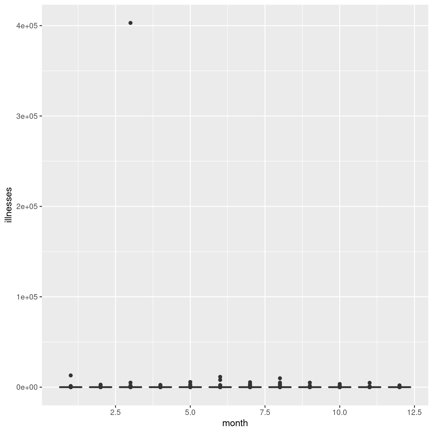
But the outlier here makes it hard to see what's going on. Let's modify this.
Your Turn 7
The outlier we just observed represents the outbreak associated with the highest number of illnesses. Which observation is this?
Display only this observation in a table.
Then, recreate the boxplots without this observation.
Here is the code we just used to make the boxplots in the last exercise:
outbreaks %>% ggplot(aes(x = month, y = illnesses)) + geom_boxplot(aes(group = month))Solution 7
outbreaks %>% filter(illnesses == max(illnesses))Solution 7
outbreaks %>% filter(illnesses == max(illnesses))outbreaks %>% filter(illnesses != max(illnesses)) %>% ggplot(aes(x = month, y = illnesses)) + geom_boxplot(aes(group = month))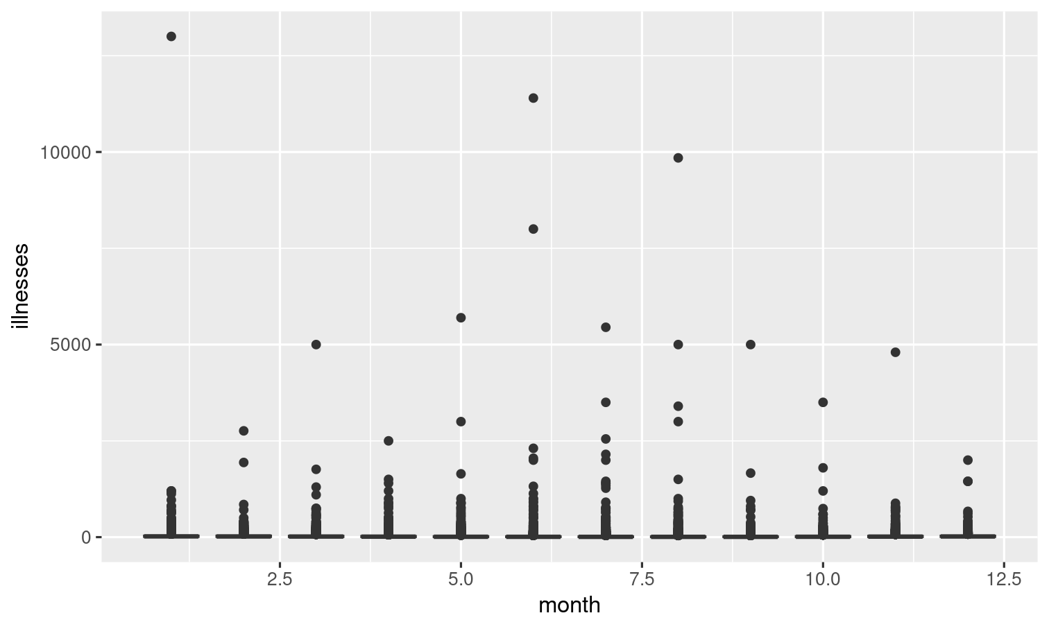
Your Turn 8
Which outbreaks lead to the highest number of illnesses?
Display these observations in a table from greatest to fewest illnesses:
Solution 8
outbreaks %>% arrange(desc(illnesses))Your Turn 9
How many different primary modes of illness are in this data set? How often does each appear in the data?
Order the rows so that the most common primary mode appears at the top.
Solution 9
outbreaks %>% count(primary_mode, sort = TRUE)or...
outbreaks %>% count(primary_mode) %>% arrange(desc(n))Looks like the most common primary mode for outbreaks in this particular data set is person-to-person.
Your Turn 10
Can you recreate this visualization of the primary modes of infection?
Hint: Look up the help page for coord_flip().
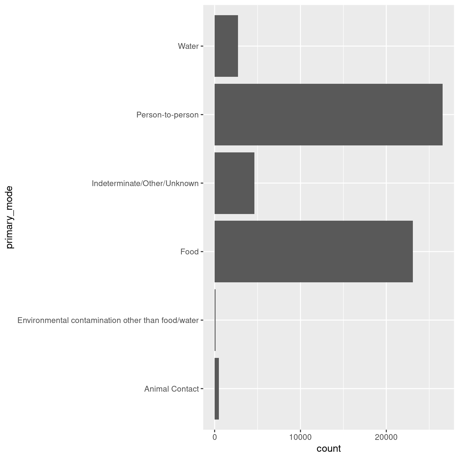
Solution 10
outbreaks %>% ggplot(aes(x = primary_mode)) + geom_bar() + coord_flip()
Notice coord_flip()
If your first inclination was to use count() then you might have come up with an answer like...
Solution 10 - alternative
outbreaks %>% count(primary_mode, name = "count") %>% ggplot(aes(x = primary_mode, y = count)) + geom_col() + coord_flip()
This one, but it's a little less efficient code-wise.
Your Turn 11
Let's take a closer look at outbreaks for which the primary mode of infection is Animal Contact.
How many Animal Contact outbreaks has each individual state had? Recreate the table below.
Hint: You will need to remove observations where state is equal to "Multistate".
Solution 11
outbreaks %>% filter( primary_mode == "Animal Contact", state != "Multistate" ) %>% count(state, sort = TRUE)Your Turn 12
Now that we know the top 3 states are Ohio, Minnesota, and Idaho, recreate this table:
Has only the Animal Contact outbreaks for those locations
Column names with "animal" appear after
stateDrop the
primary_modecolumn
Solution 12
outbreaks %>% filter( primary_mode == "Animal Contact", state %in% c("Ohio", "Minnesota", "Idaho") ) %>% relocate( contains("animal"), .after = state ) %>% select(-primary_mode)Your Turn 13
Visualize the relationship between year and number of illnesses with a smooth line plot:
Before you plot, exclude the outlier we previously identified (the outbreak with the max number of illnesses).
Color each line by its primary mode.

Solution 13
outbreaks %>% filter(illnesses != max(illnesses)) %>% ggplot(aes(y = illnesses, x = year, color = primary_mode)) + geom_smooth(se = FALSE)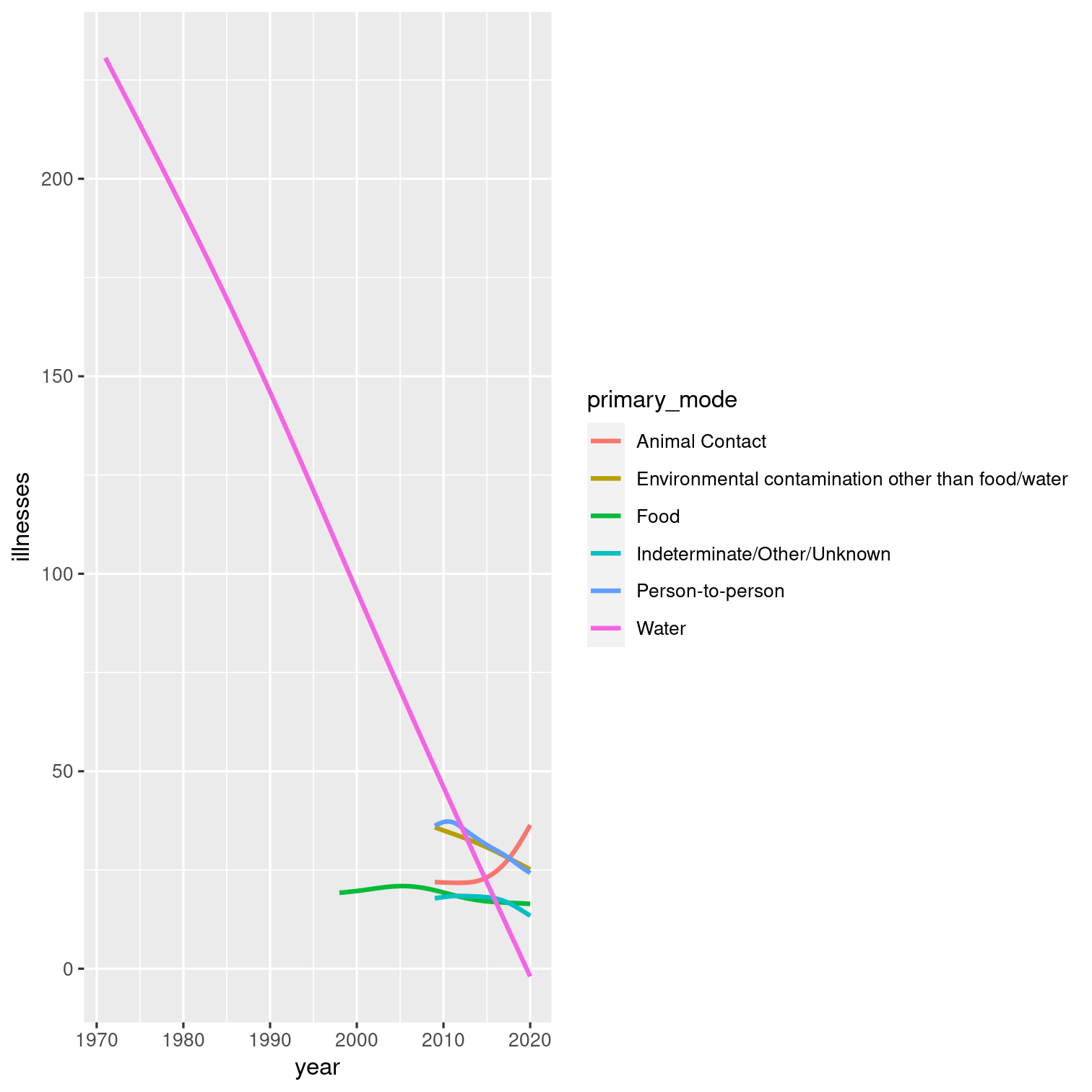
Your Turn 14
Visualize the number of illnesses in Washington DC, grouped by primary mode of infection using a "violin plot". Hint: You may need to investigate geom_violin().
(Don't worry if your plot dimensions look different than the plot below.)
## Warning: Groups with fewer than two data points have been dropped.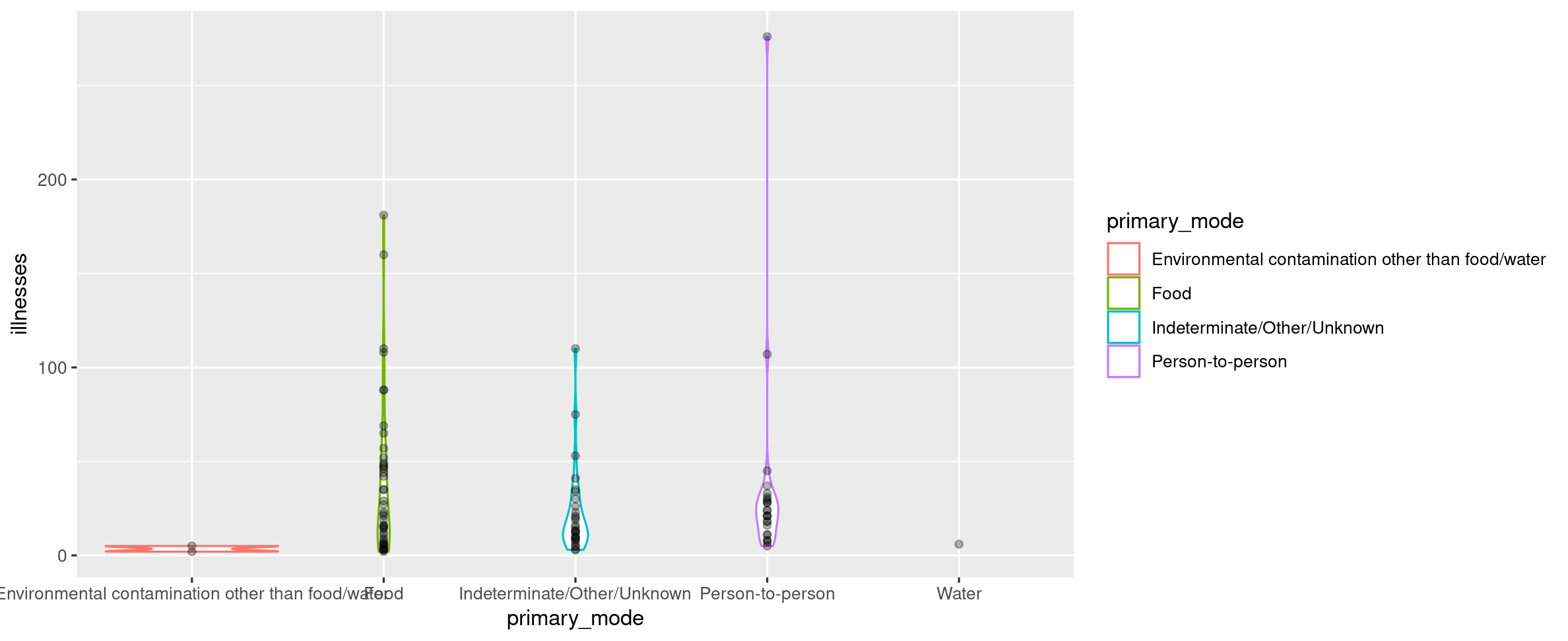
Solution 14
outbreaks %>% filter(state == "Washington DC") %>% ggplot(aes(x = primary_mode, y = illnesses)) + geom_violin(aes(color = primary_mode)) + geom_point(alpha = 0.3) # any alpha value < 1 is OK
Your Turn 15
Let's focus only on Washington DC and food borne illnesses. Show the most recent outbreaks in a table from most recent to least recent.
Hint: Which two columns contain date information?
Solution 15
outbreaks %>% filter( state == "Washington DC" & primary_mode == "Food" ) %>% arrange(desc(year), desc(month))Your Turn 16
Continue to focus only on Washington DC and food borne illnesses.
Use tidyverse functions to display the unique values of food_vehicle as a vector, as shown below:
## [1] NA ## [2] "deviled eggs" ## [3] "sandwich, tuna salad; sandwich, chicken salad" ## [4] "sandwich, chicken; pork, roasted" ## [5] "other cheese, pasteurized; honeydew melon; potato, fried" ## [6] "sandwich, chicken" ## [7] "strawberries; watermelon" ## [8] "pasta salad" ## [9] "sandwich, other specialty" ## [10] "quesadilla, chicken" ## [11] "tuna, unspecified" ## [12] "ice" ## [13] "onion, tart; mixed vegetables, unspecified; green salad" ## [14] "water" ## [15] "pastry, paris-brest; tomato, basil and mozzarella salad" ## [16] "chicken, other; potato, mashed; caesar salad" ## [17] "chicken, grilled; green salad" ## [18] "fish" ## [19] "tomato, unspecified; avocado, unspecified; guacamole, unspecified; cilantro, unspecified"## [20] "pasta-based salads unspecified" ## [21] "fish, amberjack" ## [22] "basil mayo"Solution 16
outbreaks %>% filter( state == "Washington DC", primary_mode == "Food" ) %>% distinct(food_vehicle) %>% pull()## [1] NA ## [2] "deviled eggs" ## [3] "sandwich, tuna salad; sandwich, chicken salad" ## [4] "sandwich, chicken; pork, roasted" ## [5] "other cheese, pasteurized; honeydew melon; potato, fried" ## [6] "sandwich, chicken" ## [7] "strawberries; watermelon" ## [8] "pasta salad" ## [9] "sandwich, other specialty" ## [10] "quesadilla, chicken" ## [11] "tuna, unspecified" ## [12] "ice" ## [13] "onion, tart; mixed vegetables, unspecified; green salad" ## [14] "water" ## [15] "pastry, paris-brest; tomato, basil and mozzarella salad" ## [16] "chicken, other; potato, mashed; caesar salad" ## [17] "chicken, grilled; green salad" ## [18] "fish" ## [19] "tomato, unspecified; avocado, unspecified; guacamole, unspecified; cilantro, unspecified"## [20] "pasta-based salads unspecified" ## [21] "fish, amberjack" ## [22] "basil mayo"Your Turn 17
Find food borne outbreaks that resulted in at least 1 death.
Display the results in a table that contains only the columns year, primary_mode, state, and deaths.
Solution
outbreaks %>% filter( primary_mode == "Food", deaths >= 1 ) %>% select(year, primary_mode, state, deaths)Your Turn 18
Calculate new variable for each outbreak: fatality_rate (the number of deaths / the number of illnesses, multiplied by 100).
Then visualize the distribution of the fatality rate with a histogram.

Solution 18
outbreaks %>% mutate( fatality_rate = deaths / illnesses * 100 ) %>% ggplot(aes(x = fatality_rate)) + geom_histogram()## Warning: Removed 7154 rows containing non-finite values (`stat_bin()`).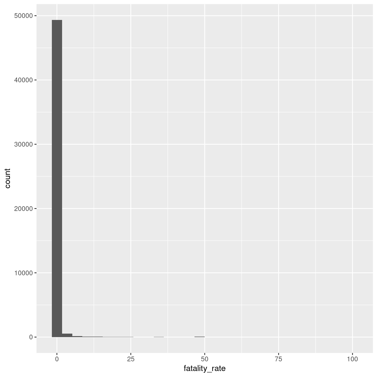
Your Turn 19
Remove outbreaks that have a fatality rate of zero.
What is the distribution of the fatality rate for the remaining outbreaks as shown by a histogram?
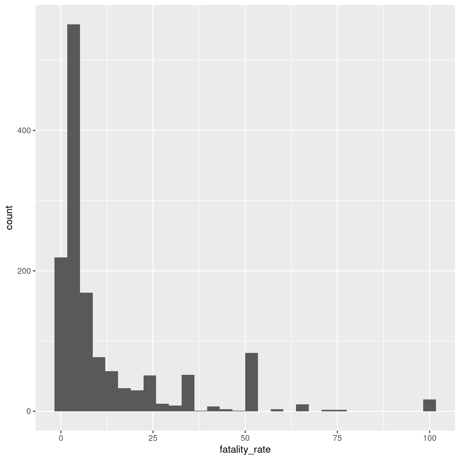
Solution 19
outbreaks %>% mutate( fatality_rate = deaths / illnesses * 100 ) %>% filter(fatality_rate > 0) %>% ggplot(aes(x = fatality_rate)) + geom_histogram()
Your Turn 20 - last one!
Find Washington DC's worst outbreak as defined by its hospitalization_rate (the number of hospitalizations / the number of illnesses, multiplied by 100).
Subset the data so you display observations that are at least 1.5 times greater than DC's mean hopsitalization rate.
Your answer should be a tibble with the highest hospitalization rates shown at the top.
Any ties should be broken by outbreaks that happened more recently.
Solution 20
outbreaks %>% filter(state == "Washington DC") %>% mutate(hospitalization_rate = hospitalizations / illnesses * 100) %>% filter(hospitalization_rate >= 1.60 * mean(hospitalization_rate, na.rm = TRUE)) %>% arrange(desc(hospitalization_rate), desc(year))Explore
Now, pair-up with at least one other groupmate and do something new with the
outbreaksdata (10 + minutes)Then share with your group.